
by Joe Callon
When considering the design of your eCommerce store, there are hundreds of different factors that come into play and need to be taken into careful consideration. However, there are some fundamental flaws in a lot of online stores that can kill sales and drive away customers in a matter of seconds.
Here are just some of the incredibly common design mistakes that merchants make when building their online store, and how you can avoid them.
No Value Proposition
There is nothing worse than landing on a site and being completely inundated with information. Popups, banners, alerts, all there to try and convert you into a customer but instead making you feel like a victim in some kind of eCommerce crime. Part of designing a killer online store is finding that information sweet spot.
Finding the right balance for your content is pretty simple. Keep your copy as minimal and stripped back as you can without missing any key elements, also making sure you get your value proposition across effectively.
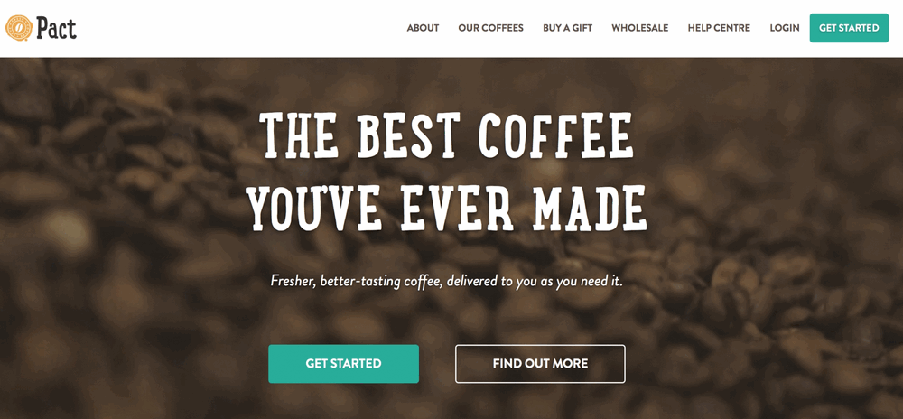
As you can see above, Pact are brilliant at immediately getting the point of your visit across. “You’re here to buy the best coffee you’ve ever made, get started now!”.
Your value proposition is essentially you saying to your customers: “Here’s why you should buy our products, even though you can buy something similar for £3 less on Amazon”.
Remember to keep your brand consistent and immediately apparent throughout your entire store. This means not just leaving it in a block of text on your about page, but making sure it also comes through in your brand, imagery, video and even your reviews and other social proof.
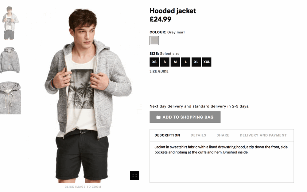
When a customer lands on a product page, they should be able to see several things:
- What the product does
- What the product looks like
- How much the product costs
Customers don’t always know exactly what they want, so by assuming that they know nothing about your product/brand, you’re ensuring that everyone is catered for and incentivised to buy.
Low Quality Photography & Video
One of the biggest downsides to online retail as opposed to running a physical store is that the customer can’t hold the products in their hands. Touch and smell are two of the biggest senses that sway a customer’s decision in retail, and these are null on the web.
However, you can help your customers feed this sensory addiction by providing high quality imagery and video content around your products. Seeing someone else hold the product in their hands helps establish a better connection between you and your customer, something which is sure to drive sales.
When it comes to video, you might be better off sticking with imagery if you’re struggling to produce something of high quality; otherwise, you’re putting yourself at risk of devaluing your brand and products through cheap-looking, cheap-sounding content.
If you need some extra tips on using fantastic product photography on your eCommerce store, check out our recent blog post.
Poor Ease of Navigation
One of the biggest barriers to conversion you can put in front of your customers is a poor navigation experience. Whether it’s too cluttered, too sparse, or just incredibly ugly to look at, there are plenty of factors that can lead to your menus becoming difficult to navigate, and therefore convert.
This might seem like an obvious mistake, but as the brain behind the site, it is all too easy to get caught up in your own knowledge of what you have on offer, not realising how challenging it might be for a visitor to find the product(s) they’re looking for.
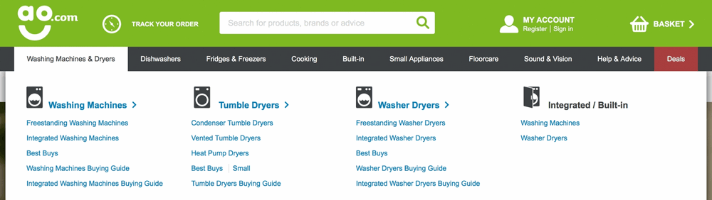
Thankfully, this is something that can be somewhat easily fixed. Using clear headings and bold separation of categories, as you can see in the above example from ao.com, you can give your customers a much easier time in the hunt for what they want or need.
Making your site easy to navigate doesn’t end with the main navigation bar though, as customers will expect (and rightly so) to be able to filter down products based on specific criteria as they get further and further down the conversion funnel.
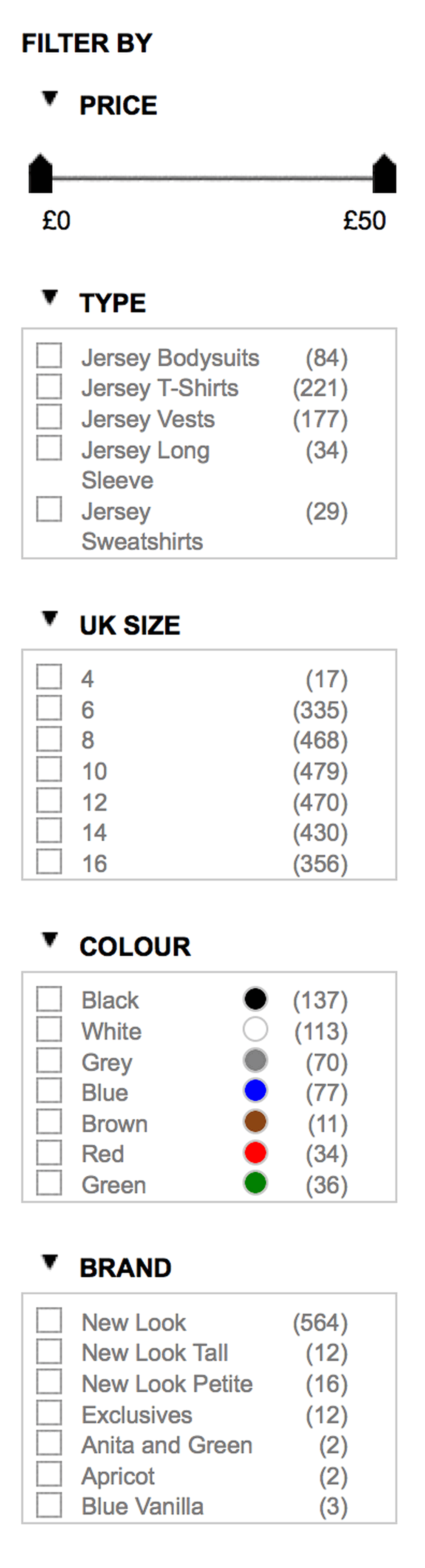
You’re always going to have a hard time selling when serving hundreds of products to a customer, without any way to narrow down that list until they find what they’re really looking for, so including plenty of filter criteria is a surefire way to save customers time and increase conversion rates from your collection pages.
Finally, make sure to also include a way for your customers to sort your products by price, alphabetically and, if you have access to the data, the best selling products on your store. People want to see what’s trending right now, and being able to see what others are buying is a great indicator of this.
No Social Post (and No Trust)
Competing with the big brands on price and customer service is difficult enough as it is, let alone having to compete with their already well established trust levels. By not including any forms of social proof on your eCommerce site, you’re setting yourself up for criticism from the sceptics.
Most people have horror stories about dealing with awful brands over the web, so are naturally cautious when purchasing from somewhere new, and just because you actually are a trustworthy, wonderful company to deal with, doesn’t necessarily mean that your potential customers are going to believe you.
Including social proof shows to your customers that you are open about the feedback you receive, whether good or bad. If you receive a bad review, make sure that you respond quickly and effectively, giving you a chance to salvage trust in your brand. This proves to any onlookers that if they have a problem (which they shouldn’t expect), it will be dealt with appropriately.

Don’t be shy about including any testimonials you receive from social media. Reviews within tweets can be just as, if not more effective, than those posted directly to your site. Also, include any notable press coverage that your company receives, as this can only go further towards proving your credibility. Simply including the logos of any publications you’ve been featured in can be enough to convince a customer that you’re a trustworthy brand.
Be Forward Thinking
In summary, being ahead of the curve when it comes to the design elements of your eCommerce store is paramount. Whilst you might be unable to compete on low, low prices, you can still beat out the global corporations by offering a more trustworthy, friendlier user experience.
For much more information on growing a successful eCommerce store, check out some of our other blog posts. If you’re not quite sure how to implement some of the things discussed in this article, don’t hesitate to get in touch with us and we’ll be more than happy to help.